Navigation
Tuesday
Jun192012

Notes from A Recent Spatial R Class I Gave

Below is a link to a pdf (compiled with the amazing knitr package) and some accompanying data for a recent short course I gave on basic spatial data import/analysis/visualization in R. The class was only two hours and some of the participants were being exposed to R for the first time so the material is limited. The class was a follow up to a previous one I did on ArcGIS. The idea was to show how to perform the same functions in R and ArcGIS and then let users decide which worked best for them (I use R for about 90% of my spatial analysis and data handling but find ArcGIS (or some GUI based GIS) pretty essential for that last 10%). 

The content/main points of the course:

  • Basic intro to R
  • Reading in a Shapefile
  • Doing a table join with a shapefile and a data.frame
  • Generating random points
  • Doing a point in polygon spatial join
  • Reading and cropping raster data
  • Doing a pixel in polygon spatial join (using extract() from the raster pacakge)
  • Plotting and annotating a shapefile in ggplot2
  • Making panel maps in ggplot2

The notes contain all the R-code and a lot of grammatical and spelling errors. I hope to improve and update this class over time. Please let me know if:

  1. You find the material useful
  2. You use it/modify for a class of your own (and please share the results)
  3. You have any major suggestions for improvements (I'm aware of most of the minor issues)
 

Tuesday
May082012

The Epic Search for the Perfect R Text Editor


I can never seem to get exactly what I want from an R text editor. Let me correct that, I can never seem to get exactly what I want from an R text editor on a MAC. I used to use Tinn-R  which met most  my needs:

  • Free,lightweight with an easy install and a slim UI
  • Good commenting and code folding tools
  • Customizable short cuts
  • Support for multiple monitors
  • An R console that was separate from the editor
  • A flexible, simple, and powerful Find and Replace Interface
  •  Good SWeave support with some built in LaTeX tools


When I made the switch to Mac I went with StatET  on Eclipse   StatET has more or less all those things, but it is not simple or straightforward (or maybe just Eclipse is too complex for me). It also has somewhat lousy graphics support and does not allow for fuzzy help searches (??’help’). However, it worked so I’ve been using it. But I just upgraded to R 2.15 and the built in graphics driver (and a few other options) no longer work.  I was never that attached to StatET anyway because the Eclipse environment is just too complex for my needs.


I really like R Studio  but it’s missing some very key features:

  • The ability to Find and Replace on a selection, rather than the whole document, plus general ‘fancy’ text editing find and replace tools
  • Multiple monitor support (I’d like to be able to detach one of the panes and move them to another monitor)
  • Customizable shortcuts
  • The ability to restart the R console without restarting the editor (this I can live without, but it’s nice to have)


So what else is out there? Maybe it’s time to try TextMate? In general I prefer free and cross platform, but I can make exceptions.

Thursday
Apr122012

R in the CPB and the role of Open Source in Promoting Transparency and Austerity

The Revolution blog links to an O'Reilly  interview with two CIO's from the Consumer Protection Bureau. The gist of the interview is "Open Source is Great, we are using it for everything; R and Big Data are the next hot thing, et cetera".  I don't mean to belittle those points, as I mostly agree them, but they are covered well in both the Revolution post and the original interview.  However what is explicitly missing from the interview (but implied by the tone) are how Open Source technologies directly answer two recent and recurring demands of government: Transparency and Austerity. At at a time when most of the electorate is calling for more transparent government (and at least in public, government seems to agree) and maybe 60% of the electorate wants less government spending open source is an obvious answer. Open source tools do not directly make government more transparent (I think legislation, institutional/cultural change are the real drivers), but at least partially addresses it: If government reports and official statistics are produced in R, for example,  and the code posted on git (as is suggested by the interview) then that allows the numeric public to cross check the nitty gritty details of whatever assumptions, models, et cetera go into those figures.

The more obvious benefit is austerity. Especially with regards to spatial software, contracts with private vendors are huge (but I have no idea what portion of government spending goes into it). Switching to open source, at least during times of austerity would not only save money but also force some competition into the relative monopolies held by ESRI, SAS, and others.  When I have some more time in the future I'll try to back those assertions regarding government spending on private vendor software contracts with some hard data.

Thursday
Apr052012

R Structure Explained

This post by Suraj Gupta explains it all. This is the first time I have seen a  concise and accessible explanation of the R environment structure and why it matters.


Addendum: This one by Digithead is also pretty good

Wednesday
Mar212012

Plotting forecast() objects in ggplot part 2: Visualize Observations, Fits, and Forecasts

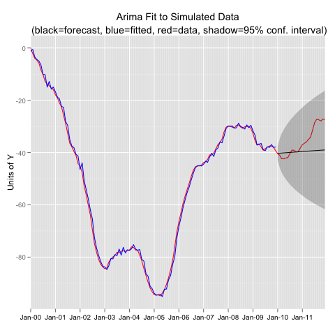
In my last post I presented a function for extracting data from a forecast() object and formatting the data so that it can be plotted in ggplot.  The scenario is that you are fitting a model to a time series object with training data, then forecasting out, and then visually evaluating the fit with the observations that your forecast tried to duplicate. Then you want a plot that includes: the original observations, the fitted values, the forecast values, and the observations in the forecast period. The function I presented in the last post extracts all that information in a nice ggplot ready data.frame. In this post I simulate data from an Arima process, fit an incorrect model, use the function from the last post to extract the data, and then plot in ggplot.


#----------Simulate an Arima (2,1,1) Process-------------
library(forecast)

set.seed(1234)   y<-arima.sim(model=list(order=c(2,1,1),ar=c(0.5,.3),ma=0.3),n=144) y<-ts(y,freq=12,start=c(2000,1))   #-- Extract Training Data, Fit the Wrong Model, and Forecast yt<-window(y,end=2009.99)   yfit<-Arima(yt,order=c(1,0,1))   yfor<-forecast(yfit)   #---Extract the Data for ggplot using funggcast() pd<-funggcast(y,yfor)   #---Plot in ggplot2 0.9 library(ggplot2) library(scales)     p1a<-ggplot(data=pd,aes(x=date,y=observed)) p1a<-p1a+geom_line(col='red') p1a<-p1a+geom_line(aes(y=fitted),col='blue') p1a<-p1a+geom_line(aes(y=forecast))+geom_ribbon(aes(ymin=lo95,ymax=hi95),alpha=.25) p1a<-p1a+scale_x_date(name='',breaks='1 year',minor_breaks='1 month',labels=date_format("%b-%y"),expand=c(0,0)) p1a<-p1a+scale_y_continuous(name='Units of Y') p1a<-p1a+opts(axis.text.x=theme_text(size=10),title='Arima Fit to Simulated Data\n (black=forecast, blue=fitted, red=data, shadow=95% conf. interval)') #p1a

Created by Pretty R at inside-R.org