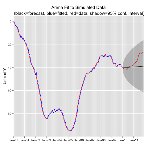
In my last post I presented a function for extracting data from a forecast() object and formatting the data so that it can be plotted in ggplot. The scenario is that you are fitting a model to a time series object with training data, then forecasting out, and then visually evaluating the fit with the observations that your forecast tried to duplicate. Then you want a plot that includes: the original observations, the fitted values, the forecast values, and the observations in the forecast period. The function I presented in the last post extracts all that information in a nice ggplot ready data.frame. In this post I simulate data from an Arima process, fit an incorrect model, use the function from the last post to extract the data, and then plot in ggplot.
#----------Simulate an Arima (2,1,1) Process-------------
library(forecast)

set.seed(1234)
y<-arima.sim(model=list(order=c(2,1,1),ar=c(0.5,.3),ma=0.3),n=144)
y<-ts(y,freq=12,start=c(2000,1))

#-- Extract Training Data, Fit the Wrong Model, and Forecast
yt<-window(y,end=2009.99)

yfit<-Arima(yt,order=c(1,0,1))

yfor<-forecast(yfit)

#---Extract the Data for ggplot using funggcast()
pd<-funggcast(y,yfor)

#---Plot in ggplot2 0.9
library(ggplot2)
library(scales)


p1a<-ggplot(data=pd,aes(x=date,y=observed))
p1a<-p1a+geom_line(col='red')
p1a<-p1a+geom_line(aes(y=fitted),col='blue')
p1a<-p1a+geom_line(aes(y=forecast))+geom_ribbon(aes(ymin=lo95,ymax=hi95),alpha=.25)
p1a<-p1a+scale_x_date(name='',breaks='1 year',minor_breaks='1 month',labels=date_format("%b-%y"),expand=c(0,0))
p1a<-p1a+scale_y_continuous(name='Units of Y')
p1a<-p1a+opts(axis.text.x=theme_text(size=10),title='Arima Fit to Simulated Data\n (black=forecast, blue=fitted, red=data, shadow=95% conf. interval)')
#p1a
Created by Pretty R at inside-R.org
